
BLOG: Jeremy Coysten of North
Developing a stand out concept for Ling Ling
North was commissioned to deliver a design concept for Hakkasan’s naughty little sister, Ling Ling. Originally born in 2000 when the restaurant Hakkasan first opened it's doors, Ling Ling was the bar/light eats area of the now Michelin starred restaurant.
As Hakkasan Group are now opening Ling Ling as a standalone restaurant/night club concept, with sites in Las Vegas, Marrakech, Oslo and Mykonos, we were asked to refresh the logo and identity we originally developed in 2000.
Part of the work involved developing a brand book to ensure staff and collaborators all understood what kind of atmosphere they are all working together to create for the customer. Cyclus Offset 100% recycled was selected as the paper that would best represent the colourful and hedonistic design.
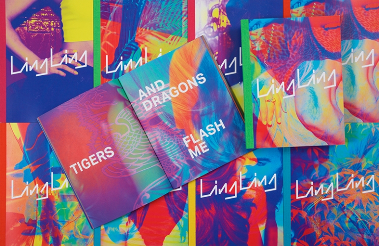
The unique design concept involved creating 10 different covers with five different spines representing 10 different narratives and consumer perspectives that represent the brand. Key to the success of the concept was bright and beautiful photography. A shoot involving 30 models and 30 Hakkasan/Ling Ling hosts took place at Ling Ling club in the MGM Grand Las Vegas where New Year celebrations inside the club were captured. The narrative was created by writer Andrew Lloyd-Jones who flew in from New York to spend the evening chatting to people about their lives and what brought them to Ling Ling, which he captured in to stories.
The images were then layered, merged together and channels changed to create odd clashes of colour and to help create the hedonistic atmosphere of the story. Four or so stories of the night were then cut up, folded and deconstructed to create a narrative which is disjointed, fragmented and chaotic, much like a night out. A relatively calm choice of font Aktiv Grotesk Bold, by Dalton Maag, balances the expressive 70’s influenced angular logo.
For the original print run for the Ling Ling brand book we used a high gloss laminated cover to achieve a high end fashion magazine feel, with Cyclus Offset selected for the inside because of its remarkable print performance which allowed us to keep the richness and colour really punchy. The colours are bright, saturated, almost as bright as the RGB colours on screen. Its recycled credentials were also a bonus. One of the challenges was applying the binding tapes to the spine as the glue was having trouble sticking to the gloss lamination of the cover so F E Burman, the printer sanded back the gloss laminate by hand.
The brand book went on to win the ‘Best in Digital Print at the Antalis Review’, we were then asked by Antalis to reproduce the book so that they could demonstrate the capabilities of Cyclus Offset to their customers. For this longer print run we changed the cover to Digigreen gloss to overcome the problem of applying the binding tapes to the spine.
Jeremy Coysten is a Partner at design company, North, a design company that builds brands and identities to help achieve business and transformative success for it’s clients