
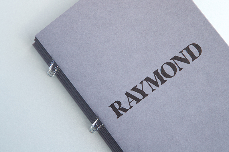
BLOG: Daniel Reed of DR Foundry

Typography designer Daniel Reed shares his experience of bringing his new typeface, Raymond, to life through a printed brochure and the role recycled papers played to highlight its historical inspiration.
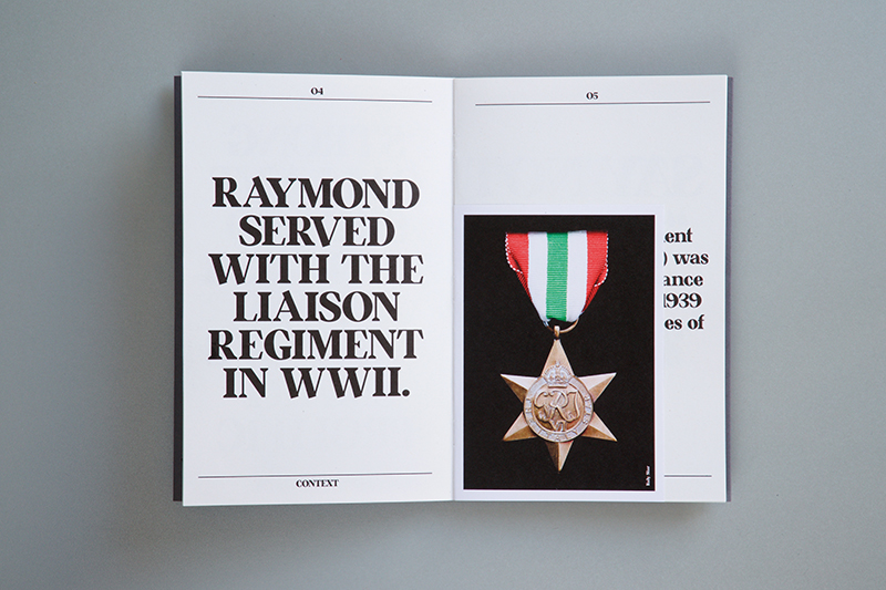
With each new typeface I create, I always develop a backstory to help contextualize it’s design. I find that having something tangible that I can work to helps me focus my ideas instead of making a typeface for aesthetics alone. My latest font, Raymond, inspired by my grandfather Ernest Raymond Reed, has roots in serifs from the early 21st century. It is bold and confident with a refined and historic look with large accented serifs. Given its historical and more dated design, I thought my grandfather’s experience in the war would be a perfect narrative to bring it to life.
With such an animated backstory, I wanted to develop a brochure and printed piece to launch Raymond. Drawing from family memories and photographs, I pieced together a short story that honors his life and that I hope will inspire others to learn about the lives of their grandparents.
Produced by ASAP Digital Ltd., the brochure uses a combination of family photos and photography of my grandfathers’ war medals. The photography is spaced evenly throughout the document spacing the key features of the typeface and small bits of information that reveal more about Raymond's time in the war. Everything from the paper to the print was considered to tonally be respectful to the narrative and compliment the bright colours of the medals and black and white portrait photography.
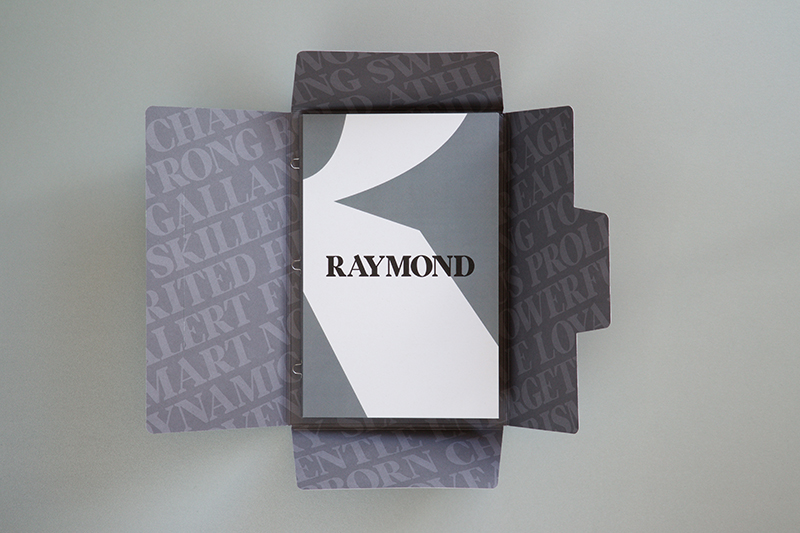
Arjowiggins Graphic’s 100% recycled papers have been such an important element in the design and creation of this brochure and really helped bring the document and font to life. The Cyclus ® and Cocoon® papers all have a subtlety to them which lets the content come through without being overpowered. Cyclus Offset provided a wonderful rustic finish and texture to the inner pages, which perfectly embodies the pieces historic theme and created a more tactile and personal experience for the reader. Cocoon Offset worked perfectly when applying the spot grey used throughout the design to hold the piece together. I was really impressed with the bright white qualities of the Cocoon paper, which was used for the photography pages. It printed with excellent vibrancy and allowed the colour to sit on top really well, elevating the design and driving the impact and nostalgia of the piece.